Styling your shop
Every visual choice is a CSS custom property on the component's own root, and its default reads one of thirteen shop-wide tokens. Changing the look of a shop is one edit, not fourteen.
/* How every knob is declared */
--fe-woo-reviews-accent: var(--fe-woo-accent, #111827);
A shop that defines nothing sees exactly what it always saw — the hex is right there in the fallback. A shop that defines the token once changes every component.
Point them at your own design system
The fields accept any CSS value, not just a hex. What you want from a shop
that already has a design system is not #0f766e, it is
var(--your-primary).
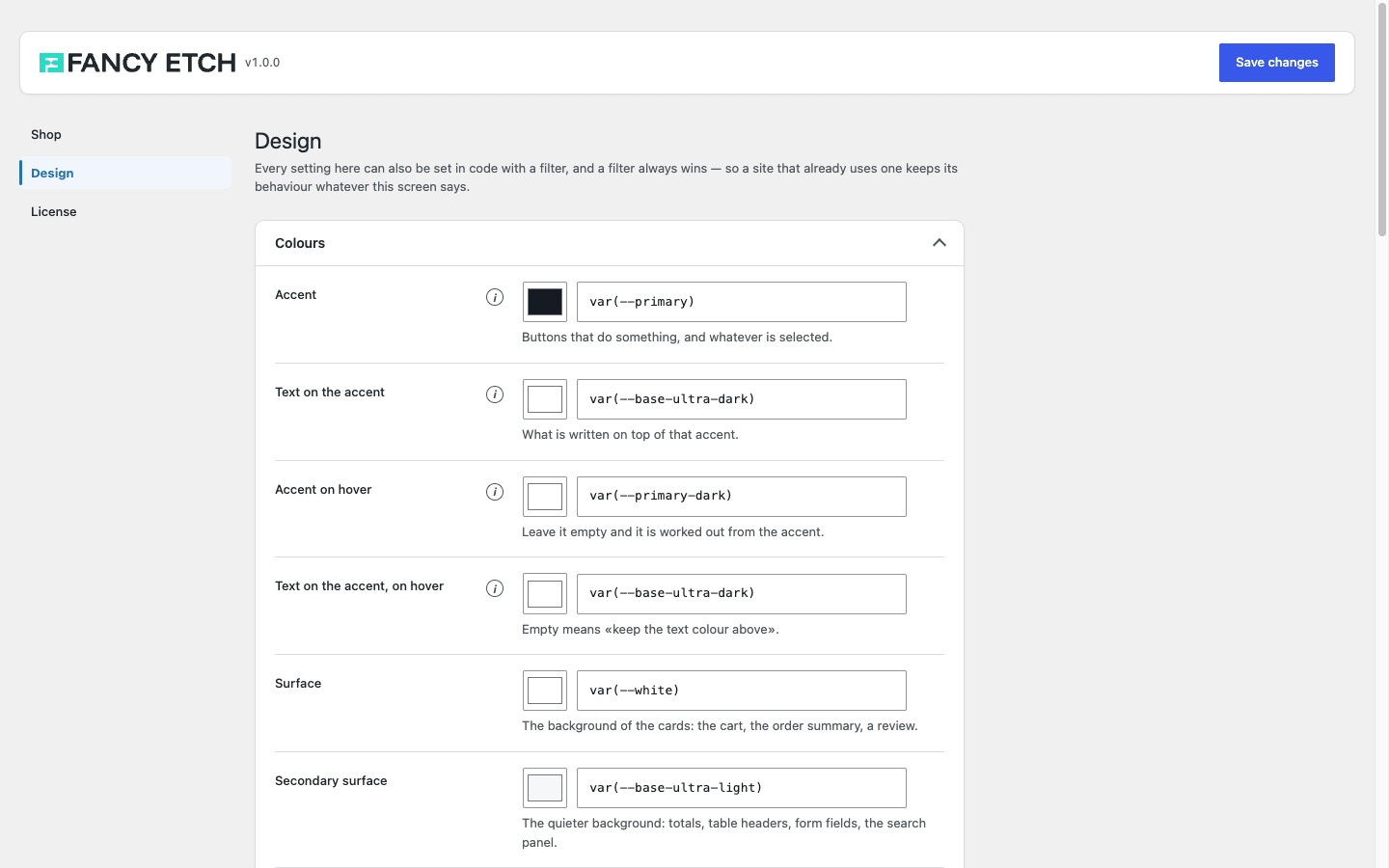
That screenshot is the demo store: its tokens read var(--primary),
var(--base-ultra-dark) and the rest of its framework's variables, so
restyling the site restyles the shop with it.
Leaving a field empty means "I am not deciding this", so the variable is not written at all and the value the plugin ships keeps applying. It does not mean transparent, and it does not mean white.
The thirteen
| Token | What it paints |
|---|---|
--fe-woo-accent | The background of buttons that do something, and of whatever is selected |
--fe-woo-accent-color | The text on that accent |
--fe-woo-accent-hover | Optional. The accent under the pointer. Empty = worked out from the accent |
--fe-woo-accent-color-hover | Optional. The text on that hover. Empty = the text colour above |
--fe-woo-surface | The background of the cards: the cart, the order summary, a review |
--fe-woo-panel | The quieter background: totals, table headers, form fields |
--fe-woo-border | Every line |
--fe-woo-color | The main text |
--fe-woo-muted | Labels, counts, the small print |
--fe-woo-focus-ring | The ring around whatever the keyboard is on |
--fe-woo-success | In stock, order placed, coupon applied |
--fe-woo-warning | Low stock, an order on hold |
--fe-woo-danger | Out of stock, a failed payment, a field to fix |
Plus the shape and type scale: --fe-woo-radius and --fe-woo-control-radius,
--fe-woo-button-weight, and --fe-woo-text-xs … --fe-woo-text-2xl.
And two for the icons that sit side by side in a header — the cart, the search
and the wishlist: --fe-woo-icon-size (1.5rem) and --fe-woo-icon-stroke
(2, the thickness of their line). Set either once and all three change
together; each component keeps its own knob in case one has to differ.
Surfaces — a card, a panel, a note — read --fe-woo-radius. Controls — a
field, a button, a pill — read --fe-woo-control-radius. With
--fe-woo-control-radius: 999px a surface that read the control radius would
turn into an oval.
The three states bring their own background
The pale background behind a success or an error is not a field: it is worked out from the colour you pick, mixed at 10% with your surface. Asking for six colours to say three things is asking somebody to get a pair right three times — and the pair that fails is not visible until a notice shows up in a real shop.
What does not follow them, on purpose
A sale price and the stars of a rating stay red and amber on their own account. They are conventions, not states: tying them to the tokens would mean changing "Error" repaints your sale prices.
The knobs every component shares
Each component's own root class declares the same sixteen properties, and each one reads the token above. They mean the same thing everywhere, so they are written down once here rather than repeated on every component below.
Swap <component> for the component's own prefix — atc, mc, cart,
gallery, filters, checkout, account, reviews, search, price,
rating, var, crumb, catalog, count, stock:
| Knob | Reads | What it controls |
|---|---|---|
--fe-woo-<component>-accent | --fe-woo-accent | Its buttons and whatever is selected |
--fe-woo-<component>-accent-color | --fe-woo-accent-color | The text on that accent |
--fe-woo-<component>-accent-hover | --fe-woo-accent-hover | The accent under the pointer |
--fe-woo-<component>-accent-color-hover | --fe-woo-accent-color-hover | The text on that hover |
--fe-woo-<component>-accent-soft | worked out | The accent at 12%, for a tint behind something chosen |
--fe-woo-<component>-surface | --fe-woo-surface | Its cards |
--fe-woo-<component>-panel | --fe-woo-panel | Its quieter backgrounds |
--fe-woo-<component>-border | --fe-woo-border | Its lines |
--fe-woo-<component>-color | --fe-woo-color | Its text |
--fe-woo-<component>-muted | --fe-woo-muted | Its labels and small print |
--fe-woo-<component>-radius | --fe-woo-radius | The corners of its surfaces |
--fe-woo-<component>-control-radius | --fe-woo-control-radius | The corners of its fields and buttons |
--fe-woo-<component>-control-size | --fe-woo-control-size | The height of those fields and buttons |
--fe-woo-<component>-button-weight | --fe-woo-button-weight | The weight of its button labels |
--fe-woo-<component>-focus-ring | --fe-woo-focus-ring | Its focus ring |
--fe-woo-<component>-gap | — | The space between its own parts |
Set one of these and you have restyled that component alone; set the token it reads and you have restyled the shop. Neither needs a nested selector.
The radios and the tick boxes
Wherever a component draws one — a payment method, a shipping option, a filter —
it is the same control, so it reads one shared set instead of six lookalikes:
--fe-woo-choice-bg, -border, -accent, -accent-color, -radius and
-focus-ring. Each defaults to the surrounding component's own value, so they
follow along without being set.
The dropdowns
The same, and for the same reason: the sorting dropdown and the variation picker are one control, and split across two stylesheets they ended up looking different — one with the browser's arrow, one with ours.
The arrow is drawn rather than native because the native one sits against the border: with a pill radius it lands inside the curve, four pixels from the edge, and nothing can move it.
| Knob | Default | What it controls |
|---|---|---|
--fe-woo-select-arrow | a grey chevron | The whole glyph, as a background-image |
--fe-woo-select-arrow-size | 0.7rem | How big it is — the room reserved for it follows |
--fe-woo-select-arrow-inset | 0.75rem | How far from the edge it sits |
--fe-woo-select-padding | 0.75rem | The space on the other side of the text |
It flips itself in [dir='rtl'], and hands the arrow back to the system under Windows high contrast, where
background images are dropped.
The contrast check
The Design tab measures ten pairs and tells you which field to change when one falls short.
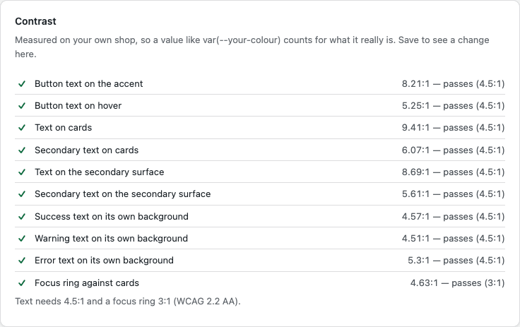
It measures on your own shop, in an iframe of the front end — because most
shops write var(--their-colour), and that variable does not exist in
wp-admin. Save, and the report re-measures.
A picker cannot express var(--your-colour) or color-mix(...). The swatch
beside each field is a convenience for choosing a hex; what gets saved is the
text field next to it.