Search
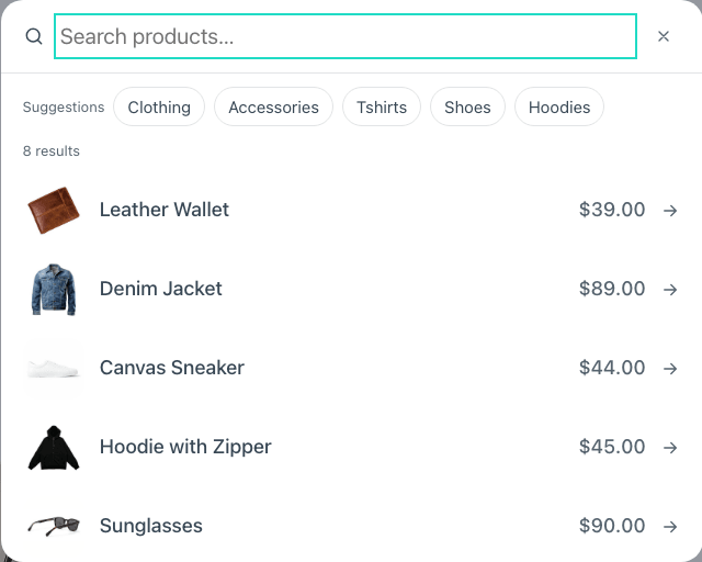
A search button that opens a dialog with results as you type, straight from WooCommerce — no page reload, and no second copy of your catalogue. Before anybody types it shows what the shop marked as featured.
Without JavaScript it is still a link to the shop's own search, and the form inside is a plain GET.
Place it anywhere — a header, a menu, a sidebar. It is a button, not a catalogue component, which is why it has a tab of its own.
Turn Show the button label off to leave only the magnifying glass. The text stays for screen readers and voice control, so the button keeps its name — it only stops being drawn.
To your catalogue template, with a heading that says what was searched: The results page.
It finds what people meant to type
Shoppers don't type a product's name the way the shop wrote it. The search finds it anyway, with no external service and no index to rebuild:
- Punctuation and accents don't count. «tshirt», «t shirt» and «T-Shirt» are the same word, and so are «cafe» and «café».
- Typos are forgiven. «hodie», «hoodye» and «hoddy» all find Hoodie. Long words allow more mistakes than short ones, and a word that starts right is allowed one more — people rarely get the first letters wrong.
- Exact matches come first. The forgiving search only steps in when the exact one finds nothing, so a search that already works never fills up with near misses.
It compares against your own catalogue, kept in a cache that refreshes when a product changes.
The results page forgives too. With Rescue empty searches on — it is out of the box, in Fancy Etch → Shop — a search that finds nothing is tried again with each word corrected against the words in your products, and the catalog bar says so: «Showing results for “hoodie”. Nothing matched “hodie” exactly». Someone who saw three hoodies in the dialog and pressed «See all results» never lands on an empty page, and a search that found something is never changed.
Details under each result
A trip needs its length and its date, a course its level, a wine its year. Result details puts them under each result's name, in one row with a divider between them:
Cocuy trek One day · Sun 30 Aug · Difficulty: Medium
Write each detail on its own line, or separate them with ;, and put each field
between % signs with whatever label you want around it:
%days%; %date%; Difficulty: %difficulty%
A field is looked up wherever your shop keeps it, in this order:
- A product attribute —
%color%finds the global Color attribute (pa_color) or one written on the product itself. - A product taxonomy — its terms, comma separated:
%product_brand%. - An ACF field, already formatted the way the field is set up, so a date reads as a date.
- A custom field — where JetEngine, ACPT, Meta Box and most others keep theirs. Use the field's name, not its label.
A detail whose fields are all empty is left out, so a product with no difficulty never shows «Difficulty:» on its own. A detail without fields — «Free shipping» — is always there.
Etch reads anything between braces in a prop as its own dynamic data, so
{difficulty} would arrive empty before the search ever saw it.
Only the fields written in this prop can be read: the site signs that list when it draws the page, and the search answers for nothing else — your products' private fields stay private. Up to eight fields.
The divider, its spacing, the size and the colour are variables:
--fe-woo-search-detail-divider takes any text in quotes — '|', '/', or ''
for none — and screen readers skip it.
Its options
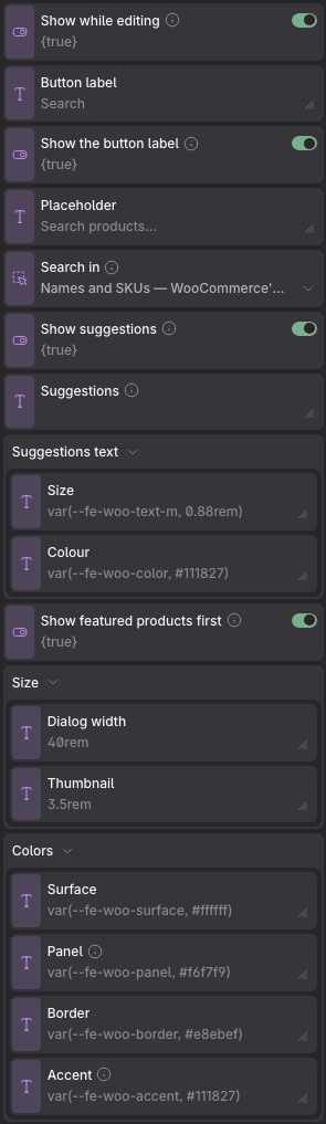
Props
| Prop | Type | Default | What it does |
|---|---|---|---|
| Show while editing | on / off | on | The dialog drawn open in the canvas, so it can be styled — it floats over the page the way it will, and nothing else moves. Turn it off once the styling is settled. |
| Button label | text | Search | |
| Show the button label | on / off | on | Off leaves just the magnifying glass. The text stays for screen readers and voice control, so the button keeps its name — it only stops being drawn. |
| Icon | image | the built-in icon | The magnifier on the button. Any SVG, from the media library or pasted as a data: URI. Its colours are replaced by the icon colour, so it follows the palette. |
| Placeholder | text | Search products… | |
| Search in | choice: names, everything | names | Where to look. WooCommerce searches product names and SKUs and nothing else, on purpose; «Also descriptions» adds the excerpt and the description, which is what a shop expects when it writes what a thing is rather than naming it — at the cost of a heavier query on a large catalogue. Typos and punctuation are forgiven either way: «tshirt» finds T-Shirt and «hodie» finds Hoodie. |
| Show suggestions | on / off | on | The row of words offered before anybody types. Turned off, the dialog opens with just the field. |
| Suggestions | text | — | Which words to offer, comma separated. Left empty it offers the shop’s own categories. |
| Suggestions text → Size | text | var(--fe-woo-text-m, 0.88rem) | |
| Suggestions text → Colour | text | var(--fe-woo-color, #111827) | |
| Show featured products first | on / off | on | What an empty search box has to say. Turned off, the dialog waits in silence until somebody types. |
| Result details | text | — | Details under each result's name, side by side with a divider between them. Write one per line or separate them with «;». Write a field between % signs and any label around it — «Dificultad: %dificultad%». A field can be a product attribute, a taxonomy, an ACF field or a custom field (JetEngine, ACPT…). A detail whose fields are all empty is left out. |
| Size → Icon size | text | var(--fe-woo-icon-size, 1.5rem) | |
| Size → Dialog width | text | 40rem | |
| Size → Thumbnail | text | 3.5rem | |
| Colors → Icon | text | currentColor | |
| Colors → Surface | text | var(--fe-woo-surface, #ffffff) | |
| Colors → Panel | text | var(--fe-woo-panel, #f6f7f9) | The row under the pointer, the thumbnail frame and the button that opens the search. |
| Colors → Border | text | var(--fe-woo-border, #e8ebef) | |
| Colors → Accent | text | var(--fe-woo-accent, #111827) | The outline and tint a suggestion chip takes when it is chosen or under the pointer. |
Variables of its own
| Variable | Default | What it controls |
|---|---|---|
--fe-woo-search-icon-size | var(--fe-woo-icon-size, 1.5rem) | The magnifier on the button. Reads --fe-woo-icon-size, shared with the cart and wishlist icons. |
--fe-woo-search-icon-stroke | var(--fe-woo-icon-stroke, 2) | How thick the magnifier's line is. Reads --fe-woo-icon-stroke, shared with the cart and wishlist icons. |
--fe-woo-search-icon-color | var(--fe-woo-color, #111827) | The colour of the button that opens it. The component writes currentColor, so it takes the colour of the header around it, like the cart and the wishlist count. |
--fe-woo-search-width | 40rem | How wide the dialog is. |
--fe-woo-search-photo | 3.5rem | The thumbnail on each result. |
--fe-woo-search-chip-size | var(--fe-woo-text-m, 0.88rem) | The suggestions offered before anybody types. They used to render a step larger than the rest of the dialog — read the note in search.css for why. |
--fe-woo-search-chip-color | var(--fe-woo-search-color, #111827) | And their text. |
--fe-woo-search-detail-size | var(--fe-woo-text-s, 0.81rem) | The details row under each result's name. |
--fe-woo-search-detail-color | var(--fe-woo-search-muted, #6b7280) | Their colour. Reads the secondary text colour. |
--fe-woo-search-detail-divider | '·' | What goes between two details, in quotes — '·', '|', '/' — or '' for none. Screen readers skip it. |
--fe-woo-search-detail-gap | 0.5rem | The space on each side of the divider. |