Variation Picker

Dropdowns, swatches, or compact swatches for cards. Combinations that lead nowhere are marked, not hidden — and price, stock and quantity limits follow the choice.
Hiding an unavailable combination makes a shopper think they misclicked. Marking it says "this one is not available", which is the actual answer.
Sold out is struck through, and can still be chosen. Relative to what is already picked: size 35 sold out in black and not in white is struck through after choosing black, and not before. Choosing it shows its price, says it is out of stock and leaves the button off — and a screen reader hears "35, out of stock", not "unavailable". A combination that does not exist at all is refused instead. Backorder counts as available: it can be bought, it just ships later.
The photo follows the choice before it is complete. Choosing blue on a
hoodie that also asks "with logo?" shows a blue hoodie straight away; price,
stock and the button wait for the second answer, because a price for half a
choice would be a guess. The photo only moves when the choice says something
about it — size 38 of a sneaker that comes in three colours leaves it alone —
and when two photos are still possible it shows the first in the order of your
attribute's values. Clear the choice and the product's own photo comes back.
The photo that moves is the one marked with data-fe-woo-variation-image, or
the Product Gallery.
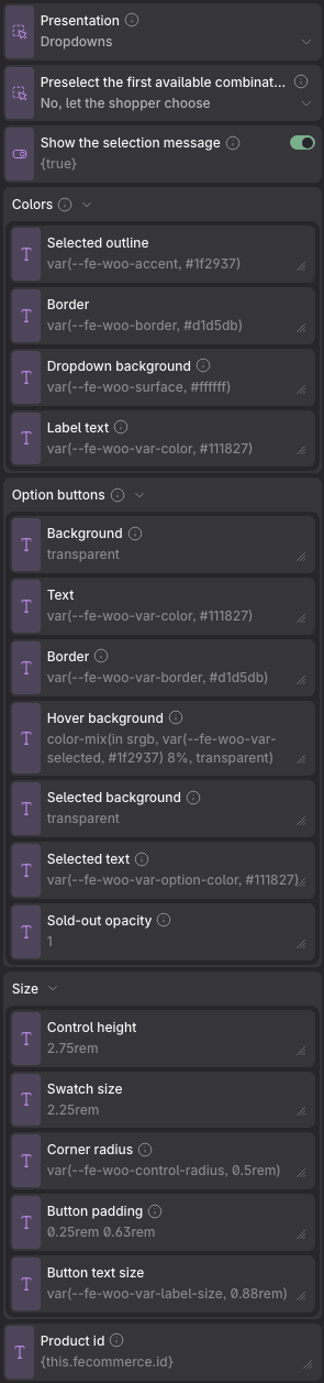
Props
| Prop | Type | Default | What it does |
|---|---|---|---|
| Presentation | choice: select, swatches, compact | select | Compact is the same swatches with the attribute names hidden from sight and smaller chips — made for a product card in a grid, where a full-size picker leaves a void in every card that has no variations. |
| Preselect the first available combination | choice: false, true | false | Off by default on purpose: choosing for the shopper risks them buying the wrong variant without noticing. Never overrides the default attributes set on the product itself. |
| Show the selection message | on / off | on | The line that confirms what is chosen («Selected. Price: $18.00»). Turn it off in a product card, where the price beside it already says the same thing — it stays a live region, so a screen reader still hears it. Problems (out of stock, combinations that do not go together) are always shown, with or without this. |
| Colors → Selected outline | text | var(--fe-woo-accent, #1f2937) | |
| Colors → Border | text | var(--fe-woo-border, #d1d5db) | |
| Colors → Dropdown background | text | var(--fe-woo-surface, #ffffff) | The dropdown drew itself white whatever the shop did, while its text followed the shop — on a dark one that was white on white. |
| Colors → Label text | text | var(--fe-woo-var-color, #111827) | The name of each question: «Colour», «Size». |
| Option buttons → Background | text | transparent | Empty by default, so the shop behind shows through. |
| Option buttons → Text | text | var(--fe-woo-var-color, #111827) | |
| Option buttons → Border | text | var(--fe-woo-var-border, #d1d5db) | Its own, so a filled button can drop the outline without taking the dropdown’s with it. Follows «Border» above until you set it. |
| Option buttons → Hover background | text | color-mix(in srgb, var(--fe-woo-var-selected, #1f2937) 8%, transparent) | Only where there is a pointer: on a touch screen the hover state sticks after a tap, and here a tap is a choice. |
| Option buttons → Selected background | text | transparent | The ring is what marks the choice — shape, not colour, so it survives greyscale. This is the fill some shops want on top, which is why it starts off. |
| Option buttons → Selected text | text | var(--fe-woo-var-option-color, #111827) | Set this whenever you set a dark selected background: the text does not follow it on its own, and that is how a chosen option ends up black on black. |
| Option buttons → Sold-out opacity | text | 1 | How faded a sold-out option looks: 1 is not at all, 0.4 is like one that does not exist. Below 1 its text drops under the 4.5:1 WCAG AA asks of a control that can still be chosen — the strike-through, the dashed border and «out of stock» for screen readers already mark it. |
| Size → Control height | text | 2.75rem | |
| Size → Swatch size | text | 2.25rem | |
| Size → Corner radius | text | var(--fe-woo-control-radius, 0.5rem) | Rounds the buttons, the dropdown and the colour swatch together. 999px makes them pills. |
| Size → Button padding | text | 0.25rem 0.63rem | The room around the text. The button never shrinks below the height above, which is what keeps it a comfortable target. |
| Size → Button text size | text | var(--fe-woo-var-label-size, 0.88rem) | |
| Product id | text | {this.fecommerce.id} | Comes from the product being shown. Inside a loop it follows each product by itself when the loop’s item is called «this»; with any other name, bind it to that name. |
Variables of its own
| Variable | Default | What it controls |
|---|---|---|
--fe-woo-var-label-size | var(--fe-woo-text-m, 0.88rem) | The attribute's name — «Colour», «Size». |
--fe-woo-var-label-weight | 500 | Its weight. |
--fe-woo-var-swatch-size | 2.25rem | How big a colour swatch is. |
--fe-woo-var-control | var(--fe-woo-var-control-size, 2.75rem) | The height a dropdown actually takes. Reads the control size; set it to break the tie on purpose. |
--fe-woo-var-face | var(--fe-woo-var-swatch-size, 2.25rem) | The same, for a swatch. |
--fe-woo-var-compact-scale | 0.73 | How much smaller everything gets in the compact layout, made for a card in a grid. |
--fe-woo-var-compact-gap | 0.38rem | The gap between controls in the compact mode, the one a card uses. |
--fe-woo-var-compact-label-size | 0.81rem | And the size of a group's name there — read by screen readers, since the compact mode hides it from sight. |
--fe-woo-var-selected | var(--fe-woo-accent, #1f2937) | The outline around what is chosen. |
--fe-woo-var-option-bg | transparent | The fill of an option button — a size, a material, a colour with its name beside it. Empty by default, so the shop behind shows through. |
--fe-woo-var-option-color | var(--fe-woo-var-color, #111827) | Its text. |
--fe-woo-var-option-border | var(--fe-woo-var-border, #d1d5db) | Its border, on its own so a filled button can drop the outline without taking the dropdown’s with it. Follows the general border until you set it. |
--fe-woo-var-option-hover-bg | color-mix(in srgb, var(--fe-woo-var-selected, #1f2937) 8%, transparent) | And its fill under the pointer. Only where there is a pointer: on a touch screen the hover state sticks after a tap, and here a tap is a choice. |
--fe-woo-var-option-padding | 0.25rem 0.63rem | The room around its text. It never shrinks below the control height, which is what keeps it a comfortable target. |
--fe-woo-var-option-text-size | var(--fe-woo-var-label-size, 0.88rem) | And the size of that text, which follows the attribute’s name until you say otherwise — that is what the compact layout shrinks. |
--fe-woo-var-option-selected-bg | transparent | The fill of the chosen one. Off by default: the outline is what marks it, and an outline is a shape rather than a colour, so it survives greyscale. |
--fe-woo-var-option-selected-color | var(--fe-woo-var-option-color, #111827) | And its text. Set it whenever you set a dark fill above: it does not follow on its own, and that is how a chosen option ends up black on black. |
--fe-woo-var-sold-out-opacity | 1 | How faded a sold-out option looks. 1 by default: it can still be chosen, so its text has to pass 4.5:1, and any lower does not. |
--fe-woo-var-label-color | var(--fe-woo-var-color, #111827) | The colour of the attribute’s name. |
--fe-woo-var-select-bg | var(--fe-woo-surface, #ffffff) | The dropdown’s background. It used to be white whatever the shop did, while its text followed the shop — on a dark one that was white on white. |
--fe-woo-var-unavailable-opacity | 0.4 | How faded a combination that leads nowhere is. Marked, never hidden — hiding it makes a shopper think they misclicked. |
--fe-woo-var-status-size | var(--fe-woo-text-m, 0.88rem) | The line that confirms what is chosen. |
--fe-woo-var-status-color | var(--fe-woo-muted, #4b5563) | Its colour. |
--fe-woo-select-arrow | url("data:image/svg+xml,%3Csvg xmlns='http://www.w3.org/2000/svg' viewBox='0 0 10 6' fill='none' stroke='%236b7280' stroke-width='1.5' stroke-linecap='round' stroke-linejoin='round'%3E%3Cpath d='M1 1l4 4 4-4'/%3E%3C/svg%3E") | The chevron drawn in a dropdown — the sorting one and the variation picker's alike. Ours, not the browser's, so it looks the same everywhere and sits where you say. |
--fe-woo-select-arrow-size | 0.7rem | How big it is. The room reserved for it is worked out from this, so changing one does not leave the other wrong. |
--fe-woo-select-arrow-inset | 0.75rem | How far it sits from the edge. Worth raising with a pill radius, where the curve eats into the corner. |