Product Gallery
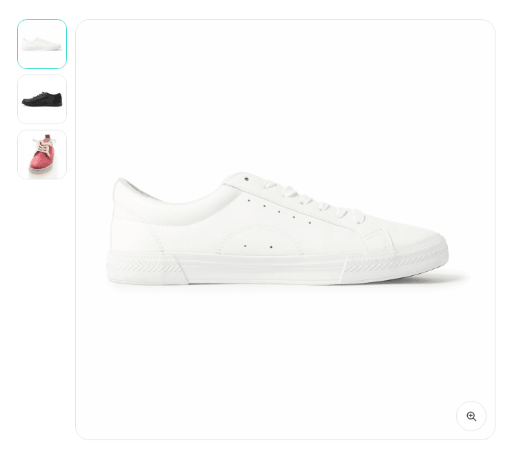
The product's photos: one main image, a strip of thumbnails and a full-size view.
The thumbnails are a real tablist — arrow keys move between them, and the whole strip is one tab stop. Picking a variation lights up its photo, without either component knowing about the other.
Props: thumbnails on or off and where they sit, open images full size, the frame, and the product to read from.
Props
| Prop | Type | Default | What it does |
|---|---|---|---|
| Thumbnails | choice: below, left, right | below | Where the strip goes. Beside the image it folds back underneath on a narrow container, so a product page laid out in two columns still works on a phone. |
| Show the thumbnail strip | on / off | on | Off leaves the main image alone — the right choice in a card, where a strip of five thumbnails is bigger than the card. |
| Open images full size | on / off | on | Adds a button that opens the photo at its original size, with the arrow keys to move between photos and Escape to leave. |
| Frame → Aspect ratio | text | 1 | The shape of the main image, e.g. 1, 4/5 or 3/2. The photo is fitted whole inside it, so the box never changes height when somebody picks another one. |
| Frame → Thumbnail size | text | 4.5rem | |
| Frame → Corner radius | text | var(--fe-woo-radius, 0.75rem) | |
| Colours → Frame background | text | var(--fe-woo-panel, #f3f4f6) | |
| Colours → Selected thumbnail | text | var(--fe-woo-accent, #111827) | |
| Colours → Border | text | var(--fe-woo-border, #d1d5db) | |
| Product | text | {this.fecommerce.id} | Left alone it follows the product being shown, which is what a product template wants. Inside a loop it follows each card's own product. |
| First image | text | {this.featuredImage} | Rendered by the server so the page shows the product before any script runs, and so the browser starts fetching it immediately. The runtime replaces it with whichever photo is selected; leave it alone unless the first image should be something other than the featured one. |
| First image alt text | text | {this.title} | Only for that first render. Once the runtime is up, each photo uses the alt text of its own attachment, which is where a shop should be writing it. |
Variables of its own
| Variable | Default | What it controls |
|---|---|---|
--fe-woo-gallery-selected | var(--fe-woo-accent, #111827) | The outline around the thumbnail being shown. |
--fe-woo-gallery-ratio | 1 | The shape of the main image — 1, 4/5, 3/2. The photo is fitted whole inside it, so the box never changes height. |
--fe-woo-gallery-thumb-size | 4.5rem | How big each thumbnail is. |
--fe-woo-gallery-thumb-ratio | 1 | Their shape, independent of the main image's. |
--fe-woo-gallery-columns | repeat(auto-fill, minmax(var(--fe-woo-gallery-thumb-size, 4.5rem), 1fr)) | The whole grid-template-columns of the strip, if the automatic fit is not what you want. |
--fe-woo-gallery-control-bg | var(--fe-woo-surface, #ffffff) | The buttons floating over the photo: full size, and the arrows. |
--fe-woo-gallery-control-color | var(--fe-woo-color, #111827) | Their glyph. |
--fe-woo-gallery-backdrop | rgb(17 24 39 / 80%) | What darkens the page behind the full-size view. |
--fe-woo-gallery-swap | 240ms | How long a photo takes to change. |
--fe-woo-gallery-swap-zoom | 300ms | How long the zoom of that change lasts. |
--fe-woo-gallery-swap-shift | 100% | How far the outgoing photo slides. |