Product Badges
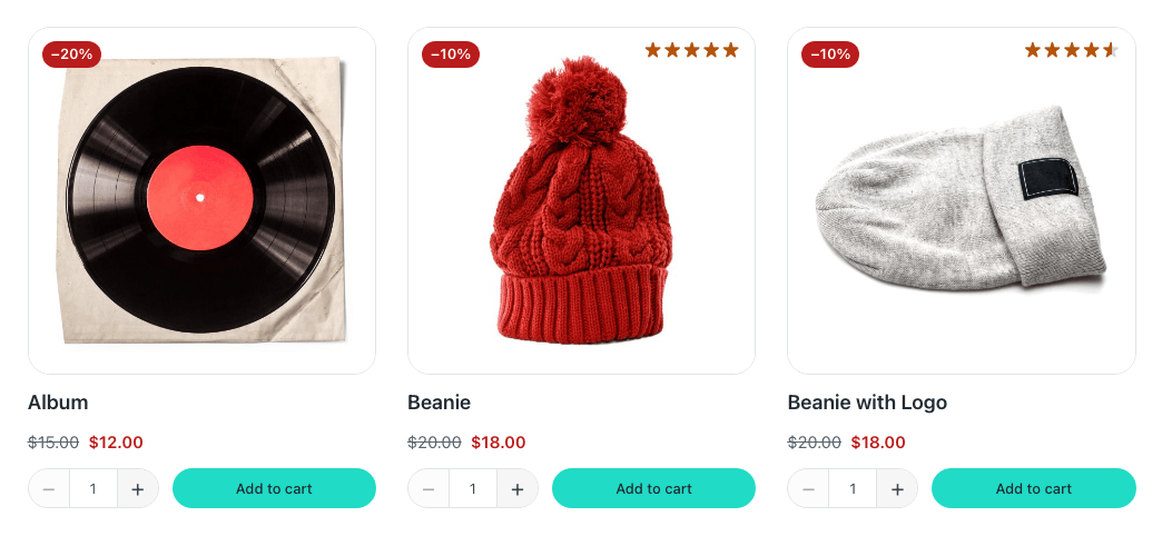
The labels on a product: its discount, and whichever others you turn on — out of stock, on backorder, featured. Each one has its own group in the panel, with a switch, its text and its two colours.
The discount is worked out from the prices and rounded to the nearest whole number, the same way the cart and the checkout round the «−20%» they print on each line, so the card and the cart never disagree about one product. When the variations are discounted by different amounts — or some are and some are not — it says «Up to −30%»: a plain figure would claim every one of them is 30% off. Empty the «Up to» text to show the largest figure with no prefix.
A badge shows when the product has it and its switch is on; when none applies, the component takes no room at all, so a card without badges is not left with a gap. In the builder every badge that is switched on shows, whatever the product being previewed, so there is always one to click and style.
Props
| Prop | Type | Default | What it does |
|---|---|---|---|
| Discount → Show it | on / off | on | |
| Discount → «Up to» text | text | {this.fecommerce.badge_up_to_label} | Only shown when the variations are discounted by different amounts — «Up to −30%» — because a plain figure would claim every one of them is 30% off. Empty it to show the largest figure with no prefix. |
| Discount → Before the figure | text | − | The minus sign by default, not a hyphen: WordPress turns a lone hyphen into a dash, «–20%», and this one it leaves alone. The cart and the checkout print the same. Write «Save » to read «Save 30%». |
| Discount → After the figure | text | % | Write «% off» to read «30% off». |
| Discount → Background | text | #b91c1c | Red on its own account, like the sale price: a convention, not a state, so changing the colour of your error messages does not repaint every sale. |
| Discount → Text | text | #ffffff | |
| Out of stock → Show it | on / off | on | |
| Out of stock → Text | text | {this.fecommerce.badge_out_of_stock_label} | |
| Out of stock → Background | text | var(--fe-woo-muted, #6b7280) | Greyed, which is what «not available» looks like, with the surface as the text — the pair «Design» already checks as muted text on the surface, so it contrasts in any palette the shop has passed. |
| Out of stock → Text colour | text | var(--fe-woo-surface, #ffffff) | |
| On backorder → Show it | on / off | off | Never together with «Out of stock»: a product on backorder can be bought, and telling a shopper it is sold out loses the sale. |
| On backorder → Text | text | {this.fecommerce.badge_backorder_label} | |
| On backorder → Background | text | var(--fe-woo-warning-soft, #fef3c7) | |
| On backorder → Text colour | text | var(--fe-woo-warning, #b45309) | |
| Featured → Show it | on / off | off | The products marked with the star in WooCommerce’s product list. |
| Featured → Text | text | {this.fecommerce.badge_featured_label} | |
| Featured → Background | text | var(--fe-woo-accent, #111827) | The brand’s own pair, the one every button is read in — so its contrast is whatever the shop already checked in «Design». |
| Featured → Text colour | text | var(--fe-woo-accent-color, #ffffff) | |
| Badge style → Text size | text | var(--fe-woo-text-xs, 0.75rem) | |
| Badge style → Weight | text | 600 | |
| Badge style → Padding | text | 0.25rem 0.5rem | |
| Badge style → Corner radius | text | var(--fe-woo-control-radius, 0.5rem) | Follows the shop’s buttons by default, so pill buttons make pill badges. 999px makes them pills on their own. |
| Layout → Direction | choice: row, column | row | Stacked is the usual corner of a product photo. |
| Layout → Alignment | choice: flex-start, center, flex-end | flex-start | Along the line when side by side; to one side when stacked. «End» with «Stacked» puts them in the right-hand corner. |
| Layout → Gap | text | 0.38rem | |
| Product badges | text | {this.fecommerce.badge_flags} | Which badges this product has, as words: «discount out-of-stock». Inside a loop it follows each product by itself when the loop’s item is called «this»; with any other name, bind it to that name. |
| Discount | text | {this.fecommerce.discount_percent_text} | The figure alone, without the sign. In a loop, the same as the one above. |
Variables of its own
| Variable | Default | What it controls |
|---|---|---|
--fe-woo-badges-discount-bg | #b91c1c | The discount badge. Red on its own account, like the sale price: a convention, not a state, so changing «Error» does not repaint every sale. |
--fe-woo-badges-discount-color | #ffffff | Its text. |
--fe-woo-badges-out-of-stock-bg | var(--fe-woo-muted, #6b7280) | Out of stock: greyed, which is what «not available» looks like. The pair «Design» already checks as muted text on the surface. |
--fe-woo-badges-out-of-stock-color | var(--fe-woo-surface, #ffffff) | Its text. |
--fe-woo-badges-backorder-bg | var(--fe-woo-warning-soft, #fef3c7) | On backorder: can be bought, will take longer — the warning pair the account’s order badges use. |
--fe-woo-badges-backorder-color | var(--fe-woo-warning, #b45309) | Its text. |
--fe-woo-badges-featured-bg | var(--fe-woo-accent, #111827) | Featured: the brand’s own pair, the one every button is read in. |
--fe-woo-badges-featured-color | var(--fe-woo-accent-color, #ffffff) | Its text. |
--fe-woo-badges-size | var(--fe-woo-text-xs, 0.75rem) | The text of every badge. |
--fe-woo-badges-weight | 600 | Its weight. |
--fe-woo-badges-padding | 0.25rem 0.5rem | The room inside each badge. |
--fe-woo-badges-direction | row | row side by side, column stacked — the usual corner of a product photo. |
--fe-woo-badges-align | flex-start | Where they sit: along the line when side by side, to one side when stacked. Each value means the same in both. |