Add to Cart

The add-to-cart form with a quantity stepper. It adds over REST — no page reload — and still works as a plain form without JavaScript.
It knows what it is looking at: a grouped product gets a "View products" link, an external one gets its own button, and a variable product without a picker beside it links to its page instead of pretending it can be added.
Its options
Every component is configured from Etch's properties panel. Add to Cart is the one with the most to say:
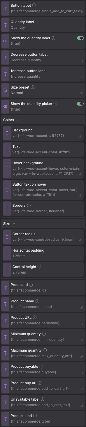
Notice the Colors group: each one reads a shop token —
var(--fe-woo-accent, #1f2937) — so a component you never touch already follows
the palette you set under Fancy Etch → Design.
Props
| Prop | Type | Default | What it does |
|---|---|---|---|
| Button label | text | {this.fecommerce.single_add_to_cart_text} | Leave the binding to use WooCommerce's own wording, already translated. It says "Add to cart" even for a variable product, because the picker is right here — "Select options" is for listings that have none. |
| Quantity label | text | Quantity | |
| Show the quantity label | on / off | on | Turn it off in a product card, where the word above a − 1 + control costs a whole line and says nothing the control does not. It is hidden from sight only: the label stays tied to the field, so the number keeps its accessible name. |
| Decrease button label | text | Decrease quantity | |
| Increase button label | text | Increase quantity | |
| Size preset | choice: full, compact | full | Compact makes the quantity picker and the button a size smaller — what a catalogue card wants. A grouped product shows a button to its page instead of its list: three quantity pickers are too much for a card, and its page is where they are chosen. Whether the picker shows at all is the switch below. |
| Show the quantity picker | on / off | on | Off leaves just the button. The quantity is still sent — one — with or without JavaScript. |
| Colors → Background | text | var(--fe-woo-accent, #1f2937) | |
| Colors → Text | text | var(--fe-woo-accent-color, #ffffff) | |
| Colors → Hover background | text | var(--fe-woo-accent-hover, color-mix(in srgb, var(--fe-woo-accent, #1f2937) 85%, var(--fe-woo-accent-color, #ffffff))) | |
| Colors → Button text on hover | text | var(--fe-woo-accent-color-hover, var(--fe-woo-atc-color, #ffffff)) | |
| Colors → Borders | text | var(--fe-woo-border, #e8ebef) | The lines between the rows of a grouped product, and the outline of a row you have to open to choose. |
| Size → Corner radius | text | var(--fe-woo-control-radius, 0.5rem) | |
| Size → Horizontal padding | text | 1.25rem | |
| Size → Control height | text | 2.75rem | Applies to the button and the quantity stepper alike. |
| Product id | text | {this.fecommerce.id} | Comes from the product being shown. Inside a loop it follows each product by itself when the loop’s item is called «this»; with any other name, bind it to that name. |
| Product name | text | {this.fecommerce.name} | Comes from the product being shown. Inside a loop it follows each product by itself when the loop’s item is called «this»; with any other name, bind it to that name. |
| Product URL | text | {this.fecommerce.permalink} | Comes from the product being shown. Inside a loop it follows each product by itself when the loop’s item is called «this»; with any other name, bind it to that name. |
| Minimum quantity | text | {this.fecommerce.min_quantity} | Comes from the product being shown. Inside a loop it follows each product by itself when the loop’s item is called «this»; with any other name, bind it to that name. |
| Maximum quantity | text | {this.fecommerce.max_quantity_attr} | Comes from the product being shown. Inside a loop it follows each product by itself when the loop’s item is called «this»; with any other name, bind it to that name. |
| Product buyable | text | {this.fecommerce.buyable} | Whether this product can go in the cart with nothing but an id and a quantity. A grouped or external product cannot, and then this shows a link to where it can be bought instead of a form that would only fail. |
| Product buy url | text | {this.fecommerce.add_to_cart_url} | Where the link goes when the product cannot be bought here. |
| Unavailable label | text | {this.fecommerce.add_to_cart_text} | What that link says: «View products», «Buy on…», «Read more». |
| Product kind | text | {this.fecommerce.type} | WooCommerce’s product type. A grouped product is not bought: its children are, one quantity each — so this switches the form for that list. |
Variables of its own
| Variable | Default | What it controls |
|---|---|---|
--fe-woo-atc-bg | var(--fe-woo-accent, #1f2937) | The button's background. |
--fe-woo-atc-hover-bg | var(--fe-woo-accent-hover, color-mix(in srgb, var(--fe-woo-atc-bg, #1f2937) 85%, var(--fe-woo-atc-color, #ffffff))) | The background under the pointer. Worked out from the accent unless you set it. |
--fe-woo-atc-hover-color | var(--fe-woo-accent-color-hover, var(--fe-woo-atc-color, #ffffff)) | Its text — the pair travels together, so a lighter hover can carry darker text. |
--fe-woo-atc-padding-inline | 1.25rem | How wide the button is around its label. The height comes from the control size. |
--fe-woo-atc-font-weight | var(--fe-woo-button-weight, 500) | The weight of the label. |
--fe-woo-atc-min-size | var(--fe-woo-control-size, 2.75rem) | The button's height. Change it only to misalign it from the stepper on purpose. |
--fe-woo-atc-status-color | var(--fe-woo-success, #15803d) | «Added to cart». |
--fe-woo-atc-error-color | var(--fe-woo-danger, #b91c1c) | Whatever went wrong instead. |
--fe-woo-atc-feedback-size | var(--fe-woo-text-l, 0.94rem) | The size of both messages. |