Mini cart
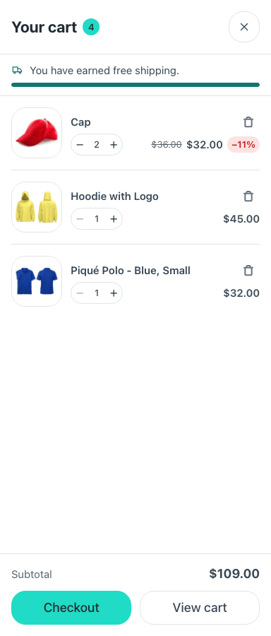
Cart Count is the header button with the item count; Mini Cart is the drawer it opens.
The count never travels in the HTML, so it is safe behind a page cache, and the drawer fetches its contents each time it opens for the same reason.
The drawer is built on a native <dialog>: focus is trapped, Escape closes it,
and focus returns to the button that opened it.
Its options
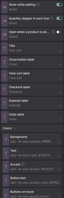
The header button and the drawer it opens are two components. These are the drawer's, Mini Cart; the button has a page of its own.
Props
| Prop | Type | Default | What it does |
|---|---|---|---|
| Show while editing | on / off | on | Only affects Etch's canvas, never the site. A closed drawer is display:none, so it would be invisible and unselectable while you build the page; with this on it is drawn where it really appears — pinned to the edge, full height, real width. Turn it off once it looks right and it stops covering the page you are editing. |
| Quantity stepper in each line | on / off | on | Lets shoppers change how many of each product they want without leaving the drawer. The shop still decides the limits: the stepper stops at the stock, and a product sold one at a time never gets one. |
| Open when a product is added | on / off | off | Shows the drawer by itself after an add to cart, as confirmation. It takes focus and covers the page, so leave it off on a shop where people add several things in a row — the cart counter already updates on its own. |
| Title | text | Your cart | |
| Close button label | text | Close | |
| View cart label | text | View cart | |
| Checkout label | text | Checkout | |
| Subtotal label | text | Subtotal | |
| Undo label | text | Undo | |
| Colors → Background | text | var(--fe-woo-surface, #ffffff) | |
| Colors → Text | text | var(--fe-woo-color, #111827) | |
| Colors → Accent | text | var(--fe-woo-accent, #1f2937) | Used for the checkout button. |
| Colors → Button text | text | var(--fe-woo-accent-color, #ffffff) | |
| Colors → Buttons on hover | text | var(--fe-woo-accent-hover, color-mix(in srgb, var(--fe-woo-mc-accent, #1f2937) 85%, var(--fe-woo-mc-accent-color, #ffffff))) | |
| Colors → Button text on hover | text | var(--fe-woo-accent-color-hover, var(--fe-woo-mc-accent-color, #ffffff)) | |
| Size → Drawer width | text | 24rem |
Variables of its own
| Variable | Default | What it controls |
|---|---|---|
--fe-woo-mc-width | 24rem | How wide the drawer is. |
--fe-woo-mc-bg | var(--fe-woo-surface, #ffffff) | Its background. |
--fe-woo-mc-backdrop | rgb(17 24 39 / 45%) | What darkens the page behind it. |
--fe-woo-mc-badge-bg | var(--fe-woo-accent, #111d2e) | The badge on the header button. |
--fe-woo-mc-badge-color | var(--fe-woo-accent-color, #ffffff) | Its number. |
--fe-woo-mc-remove | #6b7280 | The × on each line. |
--fe-woo-mc-remove-active-color | #ffffff | That × once it is pressed. |
--fe-woo-mc-danger | var(--fe-woo-danger, #b91c1c) | A line that can no longer be bought. |
--fe-woo-mc-sale-bg | #fee2e2 | The badge on a discounted line. |
--fe-woo-mc-sale-color | #b91c1c | Its text. |
--fe-woo-mc-progress | #0f766e | The bar of a free-shipping goal. |
--fe-woo-mc-track | var(--fe-woo-border, #e5e7eb) | The unfilled part of that bar. |
--fe-woo-mc-image-size | 4.5rem | The product photo on each line. |
--fe-woo-mc-enter | 0.32s | How long the drawer takes to slide in. |
--fe-woo-mc-leave | 0.2s | And to slide out — shorter on purpose, because a dismissal that lingers feels slow. |