Attribute Filter

One attribute people pick by reading: size, material, capacity. Global attributes only.
Place it on its own, beside the grid or in a sidebar of yours. It is one of the groups of Catalog Filters — if you use both, turn this group off there, or it shows up twice. How every filter behaves — links, folding, «show more» — is on Filters.
Its options
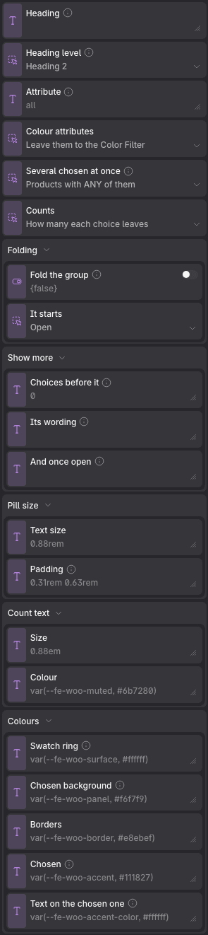
Props
| Prop | Type | Default | What it does |
|---|---|---|---|
| Heading | text | — | What this group is called. Leave it empty to keep the name the attribute or the taxonomy already has — which stays right when somebody renames one. Ignored when this filter draws more than one group. |
| Heading level | choice: h2, h3, h4 | h2 | On its own beside the grid it is usually an h2; inside a sidebar under its own heading, an h3. |
| Attribute | text | all | The attribute name — «color», «size» — or «all» for every one the shop uses. An attribute with no terms in use never shows. |
| Colour attributes | choice: except, all | except | |
| Several chosen at once | choice: or, and | or | «Any» is what most people mean when they tick two. WooCommerce's own widget defaults to «all». |
| Counts | choice: yes, brackets, no | yes | |
| Folding → Fold the group | on / off | off | Turns the title into a disclosure, so a long column reads as a list of headings. A group that is filtering something always opens, whatever the state below says. |
| Folding → It starts | choice: open, closed | open | |
| Show more → Choices before it | text | 0 | How many choices a group shows before the rest go behind the button. 0 shows every one. Every choice is in the page either way, so nothing is lost without JavaScript. |
| Show more → Its wording | text | — | Empty is «Show 12 more», translated. Write your own with {count} where the figure goes. |
| Show more → And once open | text | — | Empty is «Show less», translated. |
| Pill size → Text size | text | 0.88rem | |
| Pill size → Padding | text | 0.31rem 0.63rem | Vertical and horizontal, as CSS writes it: «0.31rem 0.63rem». |
| Count text → Size | text | 0.88em | |
| Count text → Colour | text | var(--fe-woo-muted, #6b7280) | |
| Colours → Swatch ring | text | var(--fe-woo-surface, #ffffff) | The gap between a chosen swatch and its outline. Only for attributes drawn as swatches. |
| Colours → Chosen background | text | var(--fe-woo-panel, #f6f7f9) | The tint behind a value once it is picked. |
| Colours → Borders | text | var(--fe-woo-border, #e8ebef) | |
| Colours → Chosen | text | var(--fe-woo-accent, #111827) | The outline of the value that is picked. |
| Colours → Text on the chosen one | text | var(--fe-woo-accent-color, #ffffff) | The label of a value that is picked. |
It reads the same variables as the whole column: see Catalog Filters.