Checkout
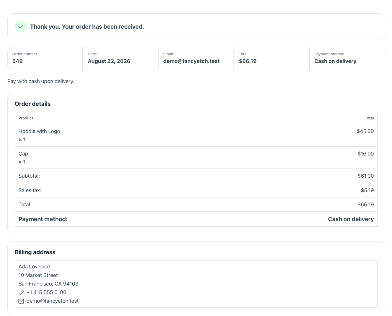
WooCommerce's classic checkout, re-skinned: contact, address, shipping and payment in one column; the order in the other. Every gateway and every plugin hook keeps working, and it shows the "thank you" receipt after paying, on the same page.
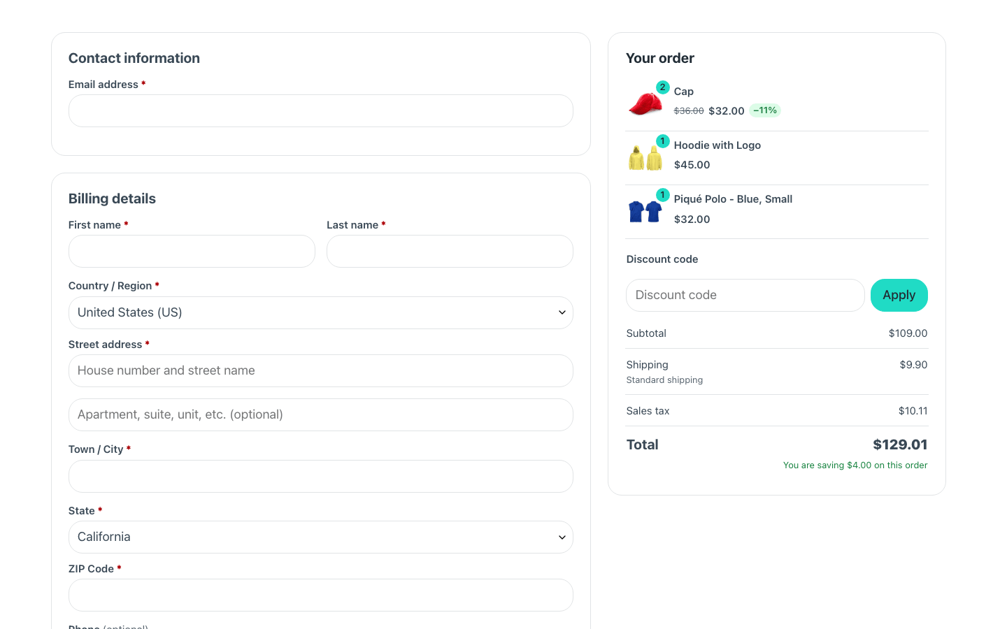
And the receipt, on the same page, once the order is paid:
| Component | What it is |
|---|---|
| Checkout | The whole thing |
| Checkout Form | The checkout without its summary |
| Checkout summary | The "Your order" panel on its own |
For two columns of your own, place Checkout Form and Checkout summary side by side.
This re-skins the classic checkout, which is a different form. On a shop using WooCommerce's checkout block, this component would style something your customers never reach — the settings screen and the builder panel both say so when they detect it.
Skipping the cart page
Fancy Etch → Shop can take one screen out of the way of buying: /cart
sends people to the checkout, the mini cart offers "Checkout" alone, and the
checkout's order summary becomes editable — a stepper and a remove button on
every line.
The three go together on purpose. Taking the cart page away without letting people fix a quantity where they land leaves somebody who added two of the wrong thing with nowhere to go.
Props
| Prop | Type | Default | What it does |
|---|---|---|---|
| Screen to preview | choice: form, receipt, failed | form | This one block is two screens: WooCommerce renders the checkout before paying and the “thank you” receipt afterwards, on the same page. The canvas never has a paid order, so this is how the receipt gets looked at while you style it. It changes nothing on the site. |
| Colors → Card background | text | var(--fe-woo-surface, #ffffff) | |
| Colors → Borders | text | var(--fe-woo-border, #e8ebef) | |
| Colors → Place order button | text | var(--fe-woo-accent, #111d2e) | |
| Colors → Button text | text | var(--fe-woo-accent-color, #ffffff) | |
| Colors → Buttons on hover | text | var(--fe-woo-accent-hover, color-mix(in srgb, var(--fe-woo-checkout-accent, #111d2e) 85%, var(--fe-woo-checkout-accent-color, #ffffff))) | |
| Colors → Button text on hover | text | var(--fe-woo-accent-color-hover, var(--fe-woo-checkout-accent-color, #ffffff)) | |
| Include the order summary | on / off | on | Off leaves only the form, so the “Your order” panel can be placed on its own with the Checkout summary component. Put exactly one summary on the page: two of them and WooCommerce refreshes whichever the browser finds first. |
Variables of its own
| Variable | Default | What it controls |
|---|---|---|
--fe-woo-checkout-invalid | var(--fe-woo-danger, #b91c1c) | A field that needs correcting. |
--fe-woo-checkout-positive | var(--fe-woo-success, #15803d) | A coupon that applied. |
--fe-woo-checkout-sale-bg | #dcfce7 | The badge on a line that is on sale. |
--fe-woo-checkout-sale-color | #15803d | Its text. |
--fe-woo-checkout-danger | var(--fe-woo-danger, #b91c1c) | A payment that failed, or a line that cannot be bought. |
--fe-woo-checkout-danger-bg | var(--fe-woo-danger-soft, #fee2e2) | The pale background behind it. |
The pieces
Placed on their own, to lay the checkout out yourself. They read the same variables as the whole component.