Wishlist Button
The heart. On a product or post template it saves that page; inside an Etch loop, each item. It is a real button that says whether it is saved with the heart and its pressed state —«Save Canvas Sneaker, toggle button, pressed»— rather than by changing its words.
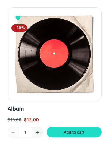
Either heart can be any SVG, the label can show always or float on hover, and a short animation plays when somebody presses it — never for anyone whose system asks for less motion.
Its options
Props
| Prop | Type | Default | What it does |
|---|---|---|---|
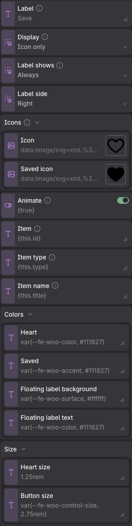
| Label | text | Save | Shown beside the heart when the button has text, and always the start of its accessible name — «Save Canvas Sneaker». It stays the same when pressed: whether it is saved is said by the heart and by the pressed state, not by changing the words. |
| Display | choice: icon, both, text | icon | Icon only is what a card wants; with the label, it reads better on a product page. |
| Label shows | choice: always, hover | always | With Icon and label. On hover, it floats beside the icon like a tooltip — also with the keyboard, and Escape hides it — and the button keeps the icon's size. |
| Label side | choice: end, start | end | |
| Icons → Icon | image | the built-in icon | |
| Icons → Saved icon | image | the built-in icon | |
| Animate | on / off | on | A short pop when saved and a small shrink when removed, only when somebody presses it. Never for anyone whose system asks for less motion. |
| Item | text | {this.id} | What gets saved. On a product page or a post it is that page; inside an Etch loop whose item is called «this», it is each item. Bind it by hand only for a loop with another name. |
| Item type | text | {this.type} | Its post type, which is how a list can be counted by kind. |
| Item name | text | {this.title} | Read by screen readers after the label, so twenty hearts in a grid are twenty different buttons, not twenty «Save». |
| Colors → Heart | text | var(--fe-woo-color, #111827) | |
| Colors → Saved | text | var(--fe-woo-accent, #111827) | |
| Colors → Floating label background | text | var(--fe-woo-surface, #ffffff) | |
| Colors → Floating label text | text | var(--fe-woo-color, #111827) | |
| Size → Heart size | text | 1.25rem | |
| Size → Button size | text | var(--fe-woo-control-size, 2.75rem) |
Variables of its own
| Variable | Default | What it controls |
|---|---|---|
--fe-fav-size | var(--fe-woo-control-size, 2.75rem) | How big the button is — the target a finger has to hit. Reads --fe-woo-control-size. |
--fe-fav-icon-size | 1.25rem | The heart. In the Count it reads --fe-woo-icon-size, shared with the cart and search icons. |
--fe-fav-color | var(--fe-woo-color, #111827) | The heart, and its label, while nothing is saved. |
--fe-fav-active | var(--fe-woo-accent, #111827) | The heart once saved. |
--fe-fav-gap | 0.5rem | The space between the heart and its label, or its badge. |
--fe-fav-focus-ring | var(--fe-woo-focus-ring, #2563eb) | The ring the keyboard focus draws. |
--fe-fav-tip-bg | var(--fe-woo-surface, #ffffff) | The floating label's background. |
--fe-fav-tip-color | var(--fe-woo-color, #111827) | The floating label's text. |
--fe-fav-tip-border | var(--fe-woo-border, #e5e7eb) | The floating label's edge. |