Accordion
FancyAccordion is a single, reusable accordion built to work for every
visual design (skin) an accordion needs across Fancy Etch templates — the
same markup contract and script drive a plain FAQ list, a numbered
full-width accordion, or an autoplaying showcase, with only a skin prop
(plus CSS) differing between them.
Anatomy
Two components: FancyAccordion (the container) and FancyAccordionItem
(one question/answer pair, used inside its items slot — one instance per
item).
The script binds to a small set of data-* attributes rather than classes,
so any skin can restyle the component freely without touching behavior:
| Attribute | Where | Purpose |
|---|---|---|
data-fe-acc | Root | Marks the accordion instance. Options (allow-multiple, open-first, autoplay, autoplay-interval) are read from plain attributes on this same element. |
data-fe-acc-item | Each item wrapper | One question/answer pair. |
data-fe-acc-button | Inside a heading | The disclosure trigger — must live inside <h2>–<h6> for the APG pattern. |
data-fe-acc-panel | Sibling of the button's heading | The answer panel — animated with a pure-CSS grid-rows transition, no JS height measurement. |
Props
FancyAccordion
| Prop | Type | Default | Notes |
|---|---|---|---|
label | string | "Accordion" | Accessible name for the whole accordion (aria-label). |
openFirst | boolean | true | Opens the first item on load. |
allowMultiple | boolean | false | Lets more than one item stay open at once. |
syncId | string | "" | Optional exclusive-sync group id — see Sync groups. Usually you don't need it; wrapping the accordions is enough. |
skin | select | "underline" | Visual design — underline, bordered, numbered, minimal. See Skins below. |
indicator | select | "arrow" | Trigger glyph shape — arrow, angle, dot. Independent of skin: any indicator can pair with any skin. |
indicatorBg | select | "filled" | Whether the indicator sits in a colored/bordered badge (filled) or floats bare (bare). |
showNumber | boolean | true | Shows the automatic item number. Only visible in the editor while skin is numbered — a plain on/off choice, not a responsive breakpoint, so it doesn't depend on viewport width. |
autoplay | boolean | false | Enables automatic cycling — see Autoplay below. |
| (Autoplay options) | condition | shown when autoplay is on | |
autoplayInterval | string | "6" | Seconds between automatic advances. Only visible in the editor while autoplay is enabled. Toggling autoplay/autoplayInterval takes effect immediately in the builder — no page reload needed. |
pauseHover | boolean | true | Pause the cycle while the pointer is over the accordion. Off = keeps running on hover; a manual click still pauses, and leaving resumes. See Autoplay. |
disableOnMobile | boolean | false | Don't run autoplay below the tablet breakpoint (max-width: 767px). Re-evaluated live as the viewport crosses the breakpoint. |
| Progress bar (group) | — | — | Look of the bar (grouped in the panel). |
progressBar.orientation | select | "vertical" | vertical (edge rail) or horizontal (bottom bar). The numbered skin is always horizontal. See Orientation. |
progressBar.color | string | "var(--primary)" | Bar fill color, per instance — a CSS color or variable. |
progressBar.width | string | "3px" | Bar thickness. |
FancyAccordionItem
| Prop | Type | Default | Notes |
|---|---|---|---|
heading | string | "I am a heading" | The question text. |
headingLevel | select | "h3" | h2–h6 — pick based on the surrounding page's heading outline. |
The answer content itself goes in the item's content slot, not a prop —
drop in any rich content (paragraphs, lists, images) as slot children.
Skins
Four visual designs ship today, all built from the same two components —
no wrapper element, no separate component per design. skin, indicator,
and indicatorBg are independent choices; mix any indicator with any skin.
| Skin | Description |
|---|---|
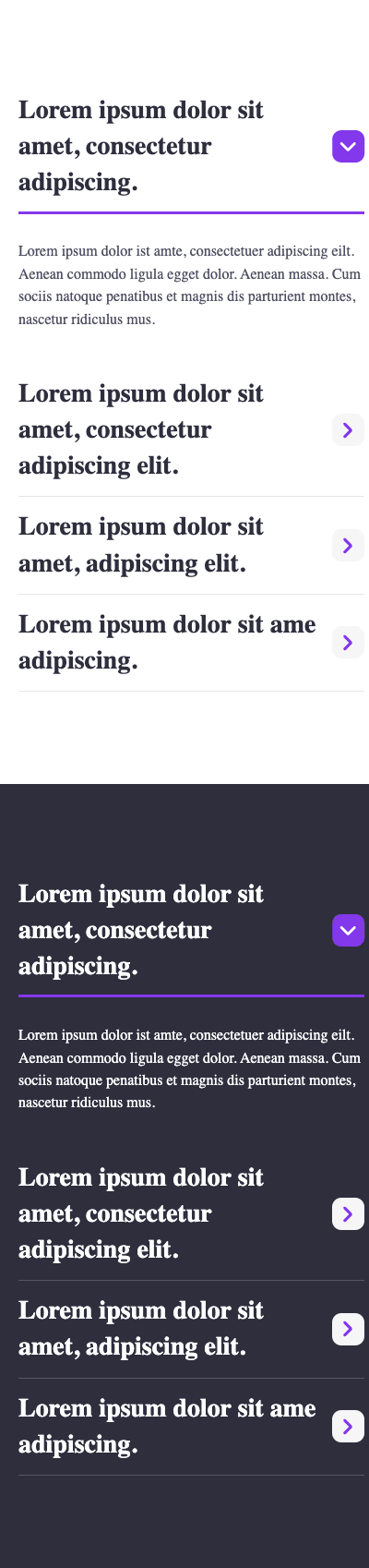
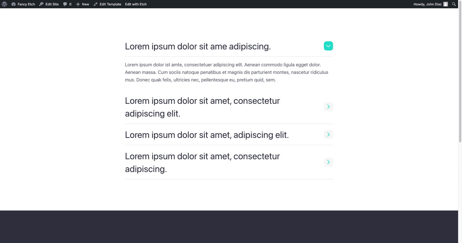
underline | Default — sliding underline beneath the trigger heading, icon in a rounded badge. |
bordered | Bordered item cards, a fixed-width underline on the button itself. Pairs naturally with indicator="dot". |
numbered | Full-width layout — automatic 01, 02... numbering via a CSS counter, no per-item prop needed. Toggle the number column on/off with the showNumber prop (only shown in the editor for this skin). |
minimal | Bare heading trigger, no icon — the cleanest look, and the one the autoplay progress rail was designed around, though you can use it with or without autoplay. |
Each skin's full CSS lives together in one place in the Style Manager: select a FancyAccordion instance, open its element editor, and the .fe-acc--skins class shows a tab for every skin (separated by /*# Skin: Name #*/ comments inside it) — no need to hunt through the whole class list to find the one you want.
Sync groups
Two or more accordions can act as one exclusive group: opening an item in any of them closes whatever's open in the others, so only one item is open across the whole group. The classic use is a FAQ split into columns.
There are two ways to form a group — pick whichever fits your layout:
- Wrap them (no id needed). Put the accordions inside one element carrying
data-fe-acc-group. Everything inside that wrapper is one group. This is the simplest way and scopes naturally — a second wrapper elsewhere is its own independent group. - Give them a
syncId. Accordions sharing the same Sync group id form a group even if they're scattered around the page. Use this when they aren't siblings under one wrapper.
You can use either or both; an accordion with no wrapper and no syncId stays
independent. Peers are found live, so accordions added later still join. Each
accordion keeps its own keyboard behaviour — the group only coordinates which
item is open.
<!-- No id: the wrapper is the group -->
<div data-fe-acc-group class="faq-columns">
  <div class="fe-acc" data-fe-acc>…</div>
  <div class="fe-acc" data-fe-acc>…</div>
</div>
Accessibility
Follows the WAI-ARIA Accordion Pattern in full:
- The trigger is a real
<button>inside a heading (<h2>–<h6>), witharia-expandedandaria-controlskept in sync automatically. - The panel has
role="region"andaria-labelledbypointing back at its button. - Closed panels are marked
inert(not just visually hidden) — they're removed from both the tab order and the accessibility tree while animating shut, not only after the transition ends. - Keyboard: ↓ / ↑ move focus between triggers (wrapping at the ends), Home / End jump to the first/last trigger, Esc closes the currently open item and returns focus to its trigger.
- All transitions respect
prefers-reduced-motion.
CSS variables
Every visual knob lives as a custom property on the root .fe-acc class —
open it in the Style Manager and retheme an instance without touching a
single nested selector. A skin (like the numbered full-width design) can
override any of these instead of redeclaring rules.
| Variable | Default | Controls |
|---|---|---|
--fe-acc-gap | 0 | Vertical space between items. |
--fe-acc-border-color | var(--base-light) | Divider color between items. |
--fe-acc-accent | var(--primary) | The skin's accent color (e.g. a sliding underline). |
--fe-acc-icon-size | 2.2rem | Size of the trigger's icon badge. |
--fe-acc-icon-radius | 0.625rem | Corner radius of the icon badge. |
--fe-acc-icon-color | var(--primary) | Icon color, closed state. |
--fe-acc-icon-bg | var(--base-ultra-light) | Icon badge background, closed state. |
--fe-acc-icon-color-open | var(--white) | Icon color, open state. |
--fe-acc-icon-bg-open | var(--primary) | Icon badge background, open state. |
--fe-acc-icon-glyph-size | 0.8em | Size of the indicator glyph itself, relative to its badge (kept smaller than the badge for a modern, minimal look). |
--fe-acc-icon-glyph | arrow SVG | The glyph's shape, as a mask-image. This is how indicator swaps shapes with zero markup changes — the glyph isn't an inline <svg>, it's a mask on the icon element. |
--fe-acc-heading-size | var(--h3) | Font size of the trigger text. |
--fe-acc-content-gap | var(--content-gap) | Row gap inside the answer panel. |
--fe-acc-duration / --fe-acc-ease | 0.5s / ease | Open/close transition timing. |
--fe-acc-progress-color | var(--primary) | Autoplay progress bar fill. |
--fe-acc-progress-bg | var(--base-light) | Autoplay progress bar track. |
--fe-acc-progress-width | 4px | Progress bar thickness. |
--fe-acc-progress-radius | 6px | Progress bar corner radius. |
--fe-acc-progress-track | 2px | The static rail running down the left edge while autoplay is on. |
Autoplay & progress bar
With autoplay on, the accordion cycles through its items automatically
and shows a progress bar on the open item, indicating time left until the
next advance. The bar is a plain CSS variable — --fe-acc-progress runs
0→1 and the fill is transform: scale(var(--fe-acc-progress)). The
script advances it each frame (rAF), so there are no @keyframes (nothing
to paste into a stylesheet) and pausing simply stops the loop, freezing the
bar exactly where it is.
- Runs only while visible. An
IntersectionObserverstarts/stops the cycle as the accordion enters/leaves the viewport. - Pauses on interaction, then resumes — it no longer turns off for good on
a click. Keyboard focus and opening an item by hand always pause (the bar
freezes); hover pauses too unless you turn
pauseHoveroff, in which case it keeps running on hover and only a manual click pauses. Either way, leaving resumes from the item you left open — the remaining time is tracked so the next advance still lands on schedule. disableOnMobileskips autoplay below the tablet breakpoint (max-width: 767px), re-checked live as the viewport crosses it.- Theme the bar per instance with
progressBar.colorandprogressBar.width— no Style Manager edit needed. - Respects
prefers-reduced-motion— autoplay never starts at all for visitors who've asked for reduced motion.
Orientation
progressOrientation (in Autoplay options) sets which way the bar runs:
| Value | Look |
|---|---|
vertical (default) | A rail on the item's inline-start edge (a full-height rail on underline/minimal, a bar flush inside the card on bordered). |
horizontal | A bar along each item's block-end edge, filling left→right — clean in every skin. |
The numbered skin always runs the bar horizontally regardless of this
option: a left rail would collide with the number column.
Earlier versions needed a hand-pasted "Fancy Accordion" @keyframes stylesheet.
That's gone — the variable-driven bar needs no Style Manager setup, so autoplay
works the moment you switch it on.
Mobile